Founded and promoted by a distinguished group of industry leaders—Rajesh Narain Gupta, Vikram Tandon, Naina Lal Kidwai, and Amit Aggarwal—Teesta combines deep institutional expertise with strategic foresight. Together, the founding team brings decades of experience across law, finance, governance, and business strategy, underpinned by integrity and global perspective.
Teesta supports founders, family offices, institutions, and governments in unlocking strategic growth, cross-border fundraising, and forward-looking innovation with a lens on sustainability, impact, and long-term value creation.
Key Visual Elements – Logo Design Development
The Teesta logo is rooted in visual storytelling and symbolism:
The upward-pointing arrow embedded in the cube symbolizes strategic elevation. • The geometric form stands for structured insight and well-rounded thinking.
The identity as a whole is crafted to represent a firm that is grounded yet visionary, bold yet balanced—a trusted partner in navigating complexity with clarity.
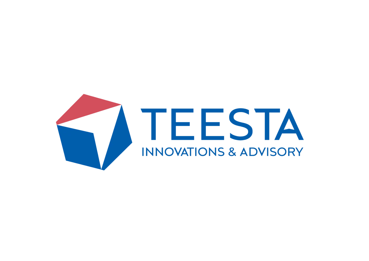
- Abstract Geometric Cube: The central form is a multi-faceted cube representing strategic depth, structure, and multidimensional thinking. It evokes a sense of balance between groundedness and vision.
- Upward Arrow Symbolism: The faces of the cube are designed to subtly form an indirect upward arrow, symbolizing growth, elevation, and forward momentum. This reflects Teesta’s mission to guide clients toward upward trajectories and transformative progress.
- Perspective and Angles: The shifting angles reflect dynamism, adaptability, and Teesta’s ability to look at problems from multiple vantage points—essential qualities in high-level advisory work.
Typography and Colour Palette
Typography:
- A clean, contemporary sans-serif font anchors the brand in clarity, trust, and modernity.
- The stylized “A” in TEESTA introduces a subtle distinctive character, signaling the brand’s sharp, solution-oriented approach.
Colour Palette:
- Deep Blue (#0057A4) – Intelligence, stability, and institutional trust.
- Crimson Red (#C74A5D) – Bold thinking, energy, and decisive action.
The Brand Message Through the Logo
The logo is a quiet but powerful visual metaphor for Teesta’s role in shaping transformative journeys:
- The upward-pointing arrow embedded in the cube symbolizes strategic elevation. • The geometric form stands for structured insight and well-rounded thinking.
The identity as a whole is crafted to represent a firm that is grounded yet visionary, bold yet balanced—a trusted partner in navigating complexity with clarity.


